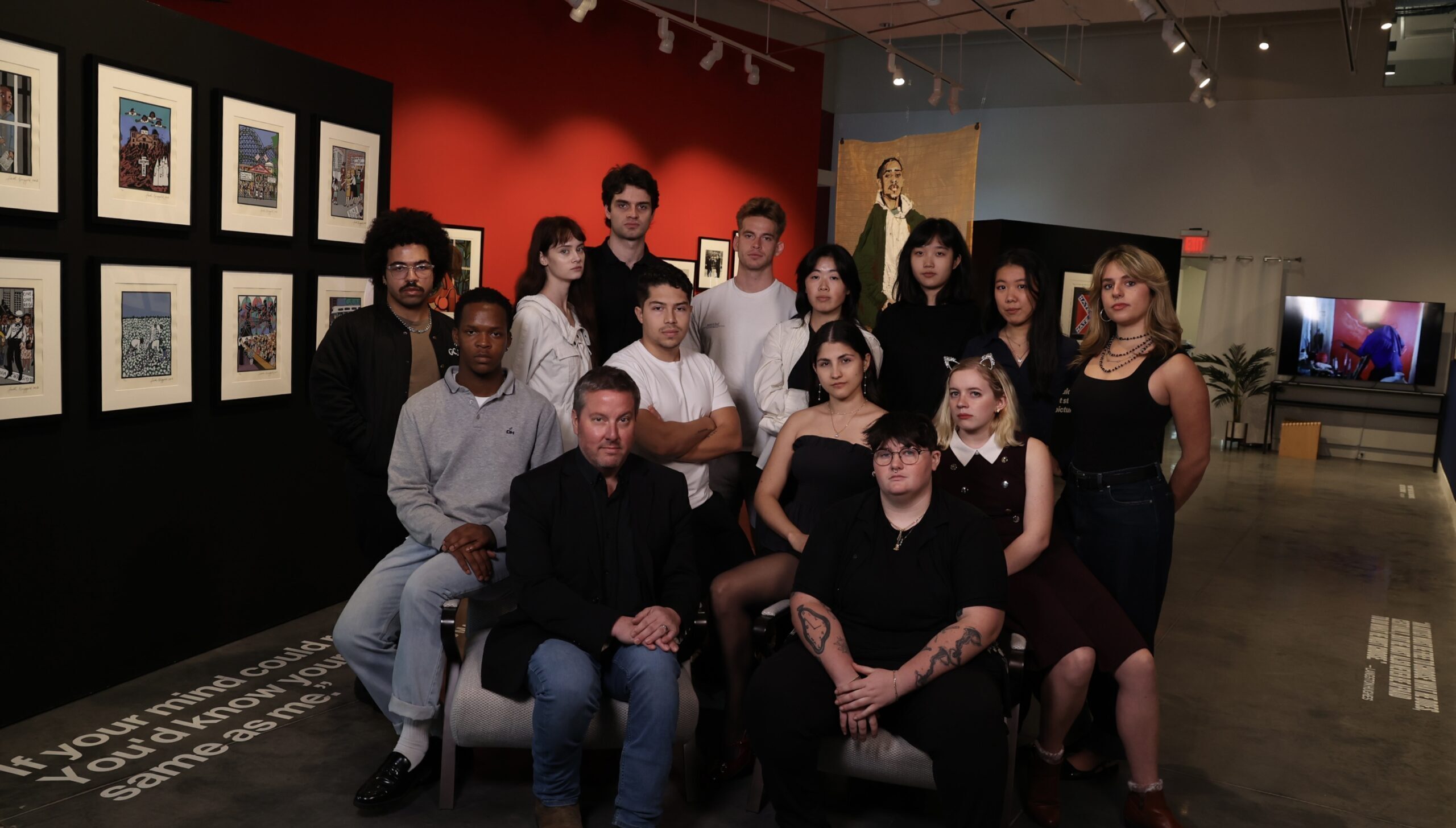
Behind every successful exhibition is a process that visitors rarely see: hours of debate, design iterations, curatorial decisions, and moments of uncertainty that ultimately give shape to the experience. For the Roots and Resilience: Art for Change exhibition—centered on African American history, resilience, and the broader African diaspora—that process was as layered and intentional as the work on the walls.
The exhibition was produced as part of a Business of Art and Design course that brings together students from across all majors, drawing on each student’s individual skill set to tackle the many facets of putting on an exhibition, including curatorial, creative direction, marketing, events, and project management. Rather than functioning in isolation, each team works in constant dialogue, negotiating ideas, aesthetics, and limitations in real time.
For the class, the negotiations look like any collaborative workplace negotiation, and one very familiar to the museum and gallery workplace. One significant challenge the team working on this exhibition faced involved color. What initially seemed like a design choice quickly became a conceptual negotiation.
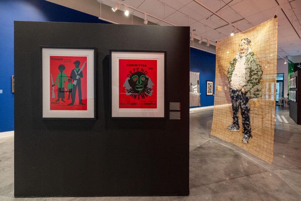
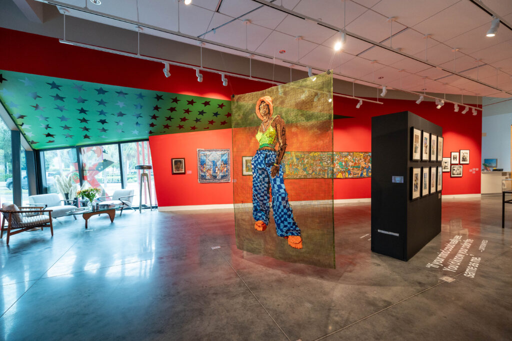
The curatorial team, whose focus included spatial narrative: layout, visitor flow, color choices within the gallery, and how historical context would unfold physically as viewers moved through the space, had a color palette planned for the exhibition that fit their needs. “That entails how the space itself will look, how the audience will view the exhibition from the moment they step into the door and start experiencing different pieces,” Lindelwa Ntshakala ’28, Visual Studies, who served as the curatorial director for this exhibition, explained.
The exhibition drew inspiration from both the Pan-African flag—red, black, and green—and the Juneteenth flag, which incorporates red, white, and blue. Each color carried historical and political meaning, but translating those meanings into a physical space required compromise.
“At first, we wanted black walls,” the Ntshakala explained. “We were inspired by the Pan-Africanist flag. But black walls are expensive—you have to think about budgeting and turning over the space for the next exhibition.”
The creative team drew their own palette from the branding system they developed, which led to some friction. “They wanted brown,” Ntshakala admitted with a laugh. “And we were like, ‘We are not putting brown in the world.’”
Zeta Bengoechea ’27, Visual Studies, was part of the team responsible for creative direction. “We were in charge of the branding and just getting the framework to exhibit the pieces,” they said. “Posters, postcards, vinyls on the windows, typography—everything that visually communicates the exhibition.”
Rather than derailing the project, the disagreement clarified it. Research into upcoming exhibitions, institutional constraints, and symbolic alignment led to a hybrid solution that merged references from both flags—a final palette of red, green, black, blue, and white.
“Every single thing you do matters,” Ntshakala said. “Everything has a reason.”
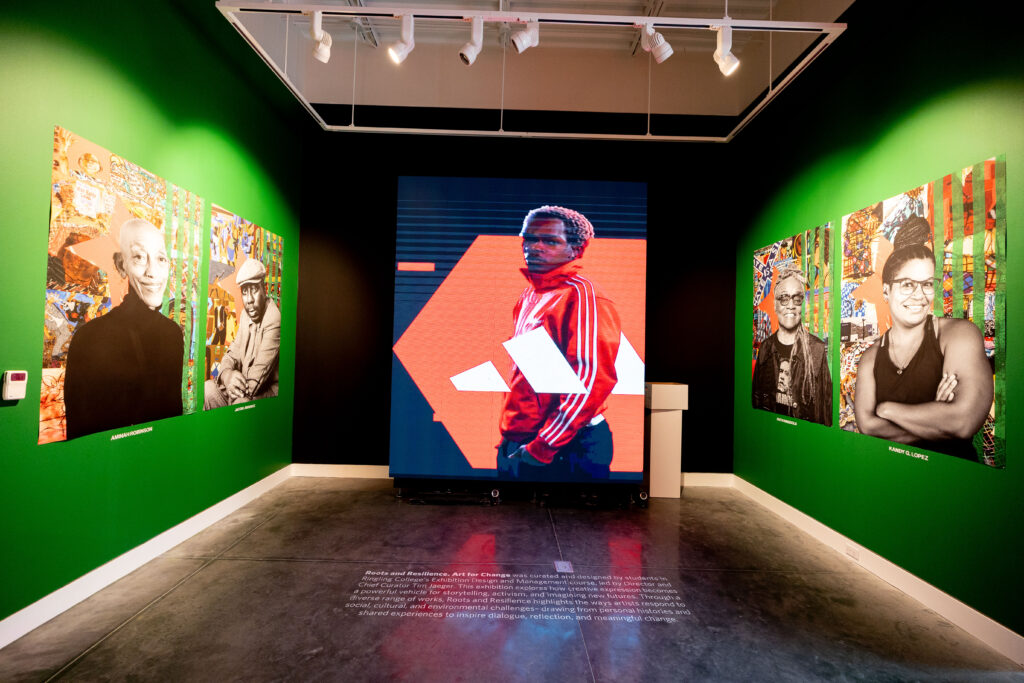
One of his favorite elements was the use of stars embedded throughout the space. “They ground the exhibition in the context of America,” he explained. “They subtly direct the audience toward the corner that speaks about history, resilience, and struggle.” The design device addressed a key challenge: how to draw attention to quieter materials, such as books and archival references, without competing with visually powerful artworks.
The class gives students an opportunity to engage in real-world exhibition-making while still in school. The work extended far beyond scheduled class hours, with students present in the gallery almost daily in the weeks leading up to the opening.
“We had class once a week for three hours,” Bengoechea said, “but I was in the gallery almost every day. Checking prints, reprinting posters, talking to sponsors—this was real responsibility.”
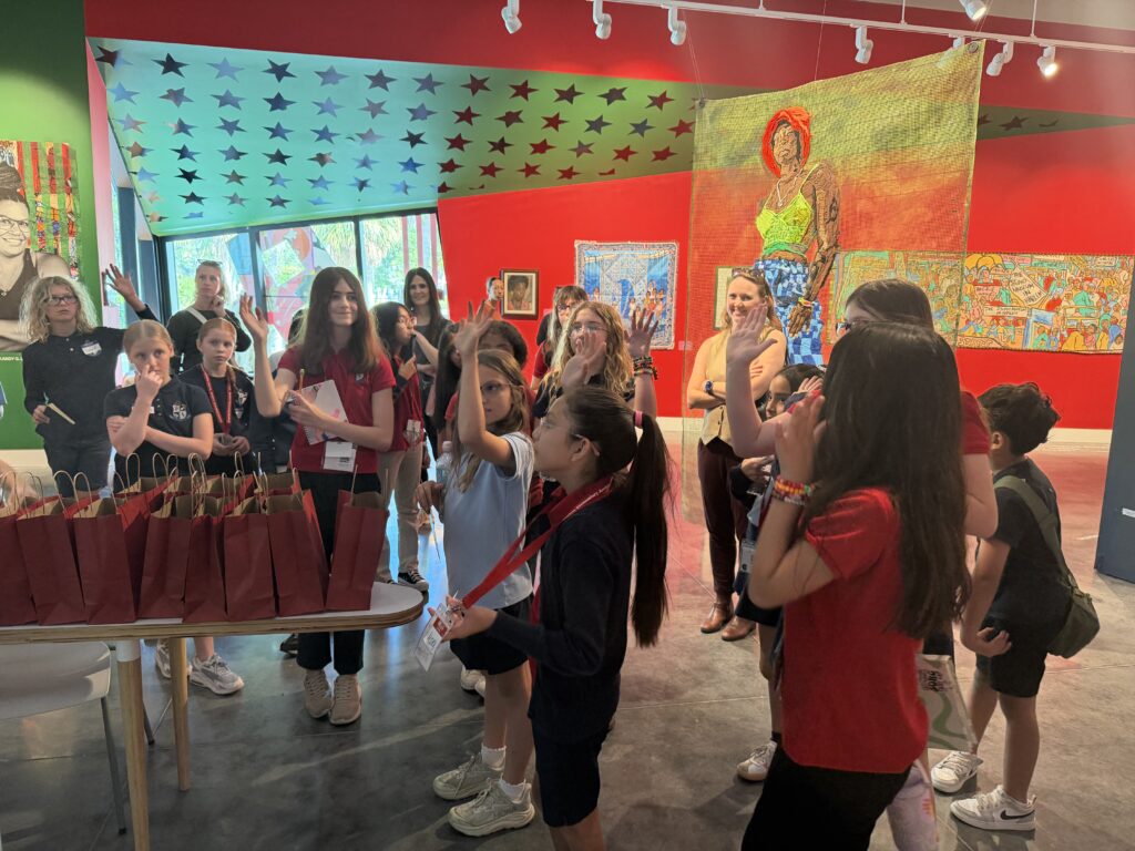
Being in the space also meant engaging with the public. Donors, community leaders, and visitors frequently stopped in, often expressing strong emotional responses. “People feel really strongly about this exhibition,” she said. “That’s exactly what we wanted.”
Sign up for our newsletter to get the latest Ringling College news in your inbox.
Contact:
Office of Marketing and Communications
communications@ringling.edu
941-309-4008